// blog
What Is a Dividend Yield and How to Interpret It
Dividend yield is the annual dividend per share divided by the current share price, expressed as a percentage, and it moves inversely with price. That means a rising yield can point to a possible bargain, or a warning that the market expects trouble.
What investors usually miss is that dividend yield is not a verdict on quality, it's a price-based income snapshot. If you use it well, it helps you compare income opportunities on a like-for-like basis. If you use it casually, it can push you straight into a yield trap.
Table of Contents
- Understanding the Dividend Yield Formula
- Why the price matters as much as the payout
- How Different Calculation Methods Change the Result
- Trailing, annualized, and projected payouts
- When a High Yield Is a Warning Sign
- What the market is really saying
- Dividend Yield Versus Related Income Metrics
- What each metric answers
- Historical Context and Market-Level Benchmarks
- Why benchmarks help strategy rules
- Real-World Examples Across Sectors and Markets
- Reading yield by business model
- Building a Dividend Yield Evaluation Checklist
- A practical screen before you buy
Understanding the Dividend Yield Formula
A dividend yield can look simple on the surface, but one question sits underneath it, how much cash is this stock returning compared with the price you pay today? That is why income investors use it as a first-pass screen. The formula is annual dividends per share divided by current share price, expressed as a percentage, as laid out in the standard definition of dividend yield Investopedia's dividend yield overview.
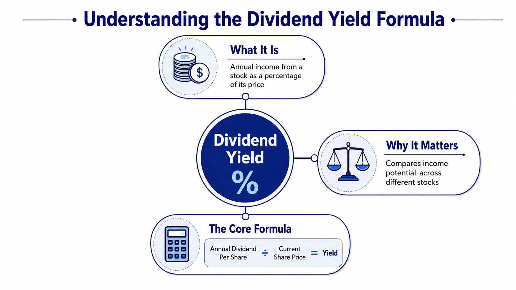
A basic example makes the mechanics clearer. If a stock pays $1 per share in annual dividends and trades at $25, the dividend yield is 4%. If the share price falls to $20 and the dividend stays the same, the yield rises to 5%. The company did not become a stronger income business overnight, the ratio changed because the price changed.
Why the price matters as much as the payout
That is the mechanical trap behind a high yield. A lower share price can make a stock screen as more attractive even when the payout has not improved at all, and even when the market is warning that the dividend may be under pressure. For a self-directed investor, the next question is not just whether the yield looks high, it is why the market is offering that yield.
Practical rule: treat dividend yield as a comparison tool, not a quality score.
Investors also need to be clear about which dividend figure they are using. Some screens use the last four quarterly payments, some use the most recent regular dividend annualized, and some use another payout convention, which is why the same stock can show different yields on different platforms Robinhood's dividend yield guide. A watchlist built on mixed methods can make one company look richer than another for reasons that have nothing to do with the business itself.
A consistent research process helps keep those comparisons honest. Tools and screeners such as best stock research tools can help you keep the inputs aligned so you are comparing stocks on the same basis instead of mixing payout rules by accident.
How Different Calculation Methods Change the Result
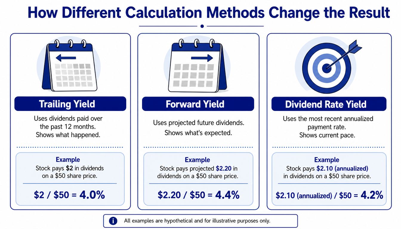
A lot of confusion starts when investors assume there is only one correct yield number. In practice, the headline figure depends on which dividend input you use, and that choice can change the result even when the business itself has not changed. The annual dividend can be framed as the last fiscal year's total dividends, the most recent regular dividend multiplied out, or the last four quarters' dividends per share.
Trailing, annualized, and projected payouts
Trailing yield looks backward. It uses dividends already paid over the past year, so it is tied to cash that left the company. Annualized yield takes the most recent regular dividend and stretches it across a full year, which works well when payouts are steady, but it can mislead if the latest payment is unusually high, unusually low, or not representative of the normal run rate. Projected, or forward, yield tries to estimate what comes next, which makes it useful for planning but dependent on assumptions about the payout path.
The distinction matters because dividend yield is a ratio, not a promise. If the numerator changes because of a special dividend, a temporary cut, or a one-time increase, the yield can move sharply without telling you much about the business's underlying earning power. Robinhood's dividend yield guide lays out these common ways of calculating the figure, and the practical lesson is the same, the method shapes the answer.
What matters is consistency. Compare stocks using the same method, or the screen stops being a real comparison.
That consistency issue becomes even more important in global portfolios. If you compare a US stock with a European stock, the yield can look similar on the screen while the income you receive differs because of currency and payout timing. A company that pays on a different schedule can also make the number look uneven from one quarter to the next, even when the business has not changed. A yield screen can therefore drift away from the cash flow you will see in your account.
For cross-border investors, strategy rules matter. A dividend-growth screen only works if the payout series and currency are normalized before the yield is judged. Without that discipline, a stock can appear to meet your threshold while failing the standard you intended to apply.
A simple mental check helps. Ask whether you are comparing what was paid, what was recently run-rate adjusted, or what is expected. Those are related, but they are not the same number.
When a High Yield Is a Warning Sign
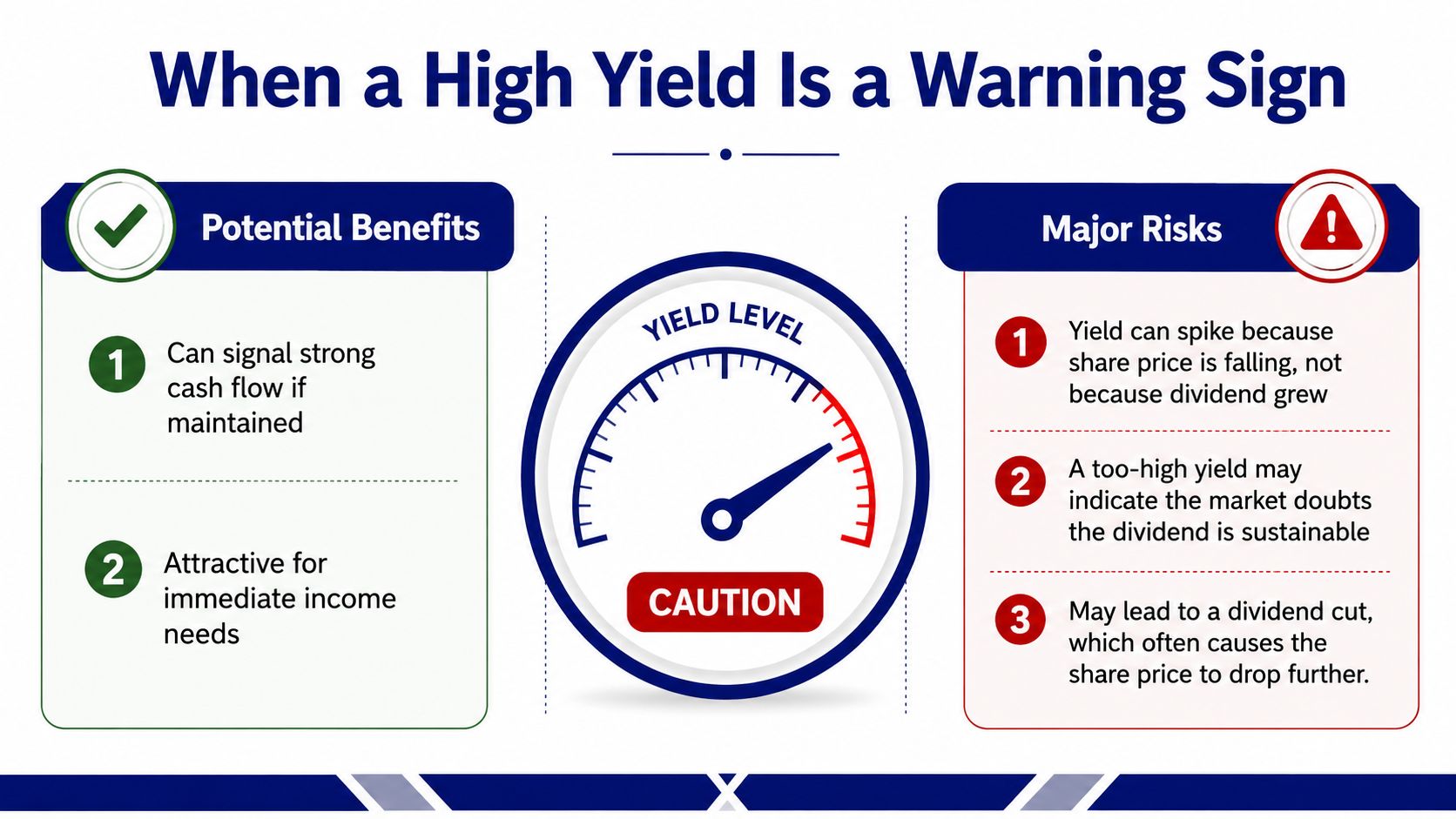
A high yield can look like free income, but the number often climbs for a less flattering reason. If the share price falls faster than the dividend changes, the yield rises even though the business may be under strain. Fidelity's dividend yield guide makes that mechanical link clear, and that is why a sudden jump in yield can be the market's way of pricing in a future cut.
What the market is really saying
A high yield can be perfectly reasonable if the company still generates enough cash to support the payout. A yield that jumps after a sharp selloff deserves more caution, because the market may be signaling stress before management says anything official. The ratio alone does not show whether the dividend is safe.
<iframe width="100%" style="aspect-ratio: 16 / 9;" src="https://www.youtube.com/embed/A4Xfk4FLjKE" frameborder="0" allow="autoplay; encrypted-media" allowfullscreen></iframe>
A yield number without context is like hearing one note and calling it a song.
The better read comes from putting yield beside dividend coverage, payout ratio, cash flow, and balance-sheet stress. Investors who focus only on the headline yield can miss the key question, whether the business is producing enough to keep paying without stretching itself. Coverage and payout ratio help answer that by showing how much room the dividend has before earnings or cash flow stop supporting it. Corporate Finance Institute's explanation of the payout ratio is useful here because it shows how the dividend sits inside the wider earnings picture.
Yield traps show up in screens all the time. They look attractive because the percentage is high, but the economics underneath may already be weakening. A stock with a shrinking share price and a payout that is barely covered can look generous right up until the dividend is reduced, and that cut can bring another price decline on top of the lost income.
A better habit is to ask three questions before adding a stock to further research. Is the yield high because the business is strong, or because the stock is weak? Does the company have enough coverage to keep paying? And is the balance sheet sturdy enough to absorb a downturn?
Dividend Yield Versus Related Income Metrics
Dividend yield tells you the current income return on price. That's valuable, but it's only one part of an income thesis. A good stock can have a modest yield and still be a better fit for a long-term dividend approach than a stock with a flashy headline number.
| Metric | What It Measures | Strength | Blind Spot |
|---|---|---|---|
| Dividend yield | Current cash income relative to share price | Fast income comparison across stocks | Doesn't show sustainability |
| Payout ratio | Portion of earnings paid as dividends | Helps judge whether the dividend looks covered | Doesn't tell you how fast the dividend may grow |
| Dividend growth rate | How fast the dividend has increased over time | Shows income trajectory | Can look strong even if the current yield is low |
| Dividend coverage | How comfortably earnings or cash flow support the payout | Better read on durability | Can vary by accounting method |
| Total return | Price change plus income | Captures the full result for shareholders | Doesn't isolate income quality |
What each metric answers
Yield asks, “What am I getting right now for the price I'm paying?” Payout ratio asks, “How much of earnings is already spoken for?” Dividend growth asks, “Is the income stream rising over time?” Total return asks, “What did the investment do for me overall?” Those are different questions, and confusing them leads to bad portfolio decisions.
That's why income investors often combine them instead of choosing just one. A stock with a moderate yield, strong coverage, and a history of rising payouts may fit a long-term dividend growth process more cleanly than a stock with a very high yield and no cushion. In practice, the best income decisions usually come from the intersection of yield and durability, not yield alone.
A second issue is that yield is backward-looking in many screens. If the price has already moved, the ratio can lag the business reality. That's another reason to pair it with payout and cash-flow checks before you buy or add to a position.
Historical Context and Market-Level Benchmarks
A yield only looks “high” or “low” once you compare it with something else. At the market level, broad indices often trade within fairly narrow historical bands, and that gives investors a useful reality check when they screen single stocks. The FTSE 100's trailing dividend yield has been around 3.1%, within a long-term historical range of 3% to 4% IG's dividend yield guide.
That matters because a yield near 3% in a large index is often read as a mature-income profile, not an aggressive growth signal. In a market where many companies pay dividends, the number alone can look ordinary even when it is above what a faster-growing index would show. Context changes interpretation, and yield screens only make sense when they are tied to the market you are comparing against.
Why benchmarks help strategy rules
Investors who use yield screens need a reference point, otherwise the cutoff becomes arbitrary. A rule that works for a UK large-cap universe may be too strict or too loose in a US growth-heavy universe, and a European income screen can sit somewhere else again. The same yield number can therefore mean very different things depending on the index, the sector mix, and how much of the market is built around payouts.
A benchmark works like a calibration tool. It tells you whether your screen is screening for income, or just screening for names that happen to stand out.
Portfolio drift shows up here as well. If your holdings' yields start looking far above the market's usual pattern, it is worth asking whether the portfolio has tilted toward stressed businesses or payouts that may not last. If the yield compresses well below what your strategy expects, the portfolio may be drifting away from the income profile you wanted in the first place.
For investors who run written rules, a comparison dashboard like Simply Wall St comparison tools can help with cross-checking relative yields, but the discipline still comes from knowing your own threshold and testing it against the market context you own.
Real-World Examples Across Sectors and Markets
A yield number can look similar across stocks and still mean very different things underneath. A utility, a consumer staples company, a bank, and a technology firm can all show income on the screen, but the source and durability of that income are not the same. Sector context matters because dividend policy sits on top of different business models.
A regulated utility with a steady payout usually behaves differently from a cyclical energy company with a high yield late in the cycle. The utility's cash generation is often tied to a more predictable operating environment, while the energy name can offer a high yield just as conditions are peaking and earnings are about to soften. Same percentage, different risk.
Reading yield by business model
Consumer staples often sit somewhere in the middle. Their payouts may not look dramatic, but the businesses are usually built around recurring demand, which can support a steadier dividend profile. Financials deserve special care because dividends can look attractive when credit conditions are favorable, but they're still exposed to funding costs, regulation, and loan quality.
Technology is different again. Some companies pay dividends, but many investors still view them through a growth lens first. When a tech name pays a dividend, the yield alone won't tell you whether that cash return is central to the thesis or just a byproduct of maturity. That's why dividend-growth strategies often separate companies by payout policy rather than treating every dividend payer the same way Monsa's dividend growth strategy page.
Cross-border holdings add another layer. A European dividend payer can look comparable to a US stock on yield alone, but if you don't normalize for currency, the cash you receive can differ. The headline figure is only useful if the comparison method is clean.
The practical habit is simple. Don't ask whether a stock has a dividend. Ask what kind of business is funding it, where the payout sits in the cycle, and whether the income is likely to survive the next round of stress.
Building a Dividend Yield Evaluation Checklist
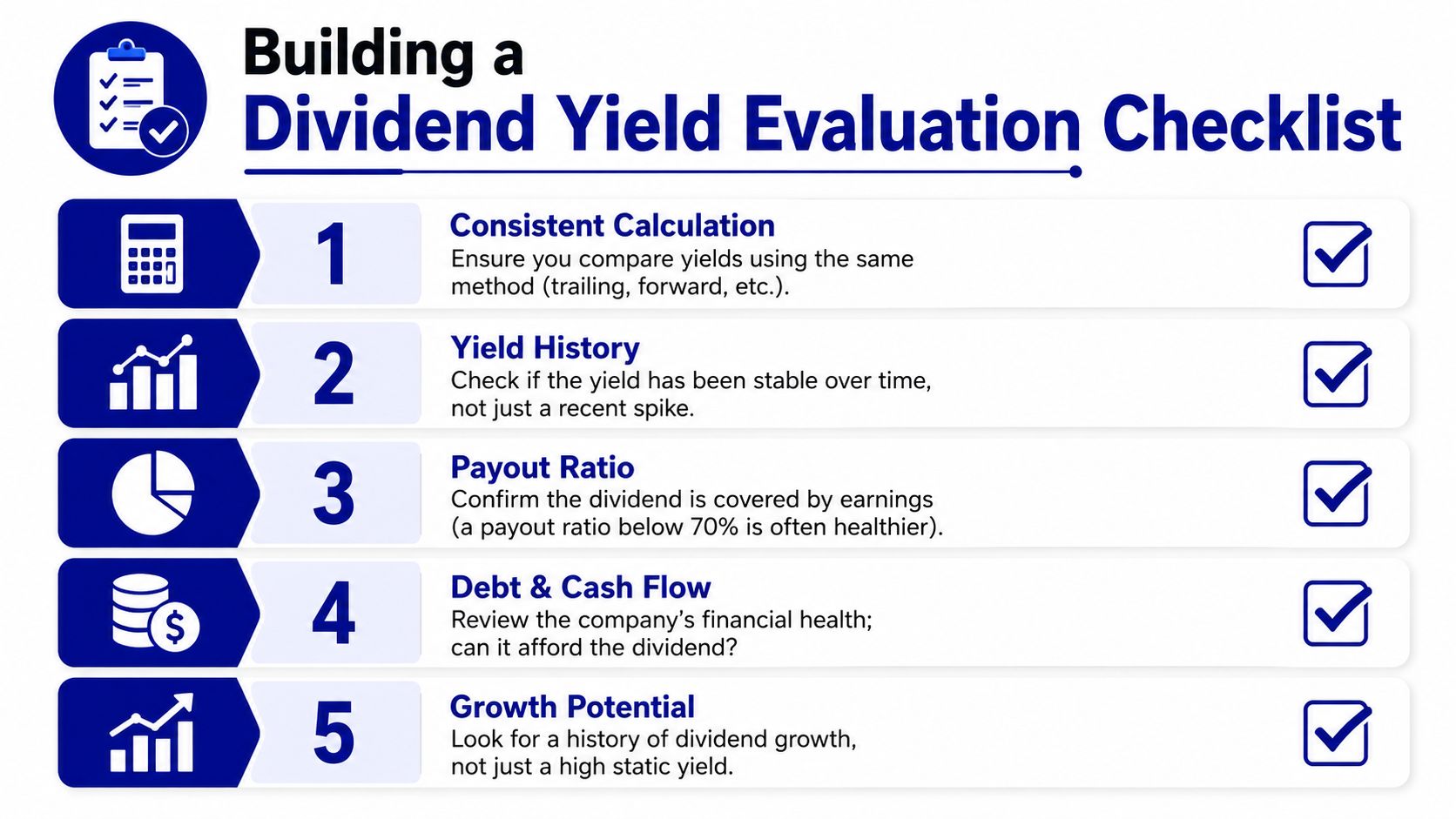
A usable dividend-yield process needs more than a screen. It needs a repeatable checklist that stops you from mixing methods, overpaying for yield, or drifting away from your strategy rules. Start with the calculation method, because comparing a trailing figure to a forward estimate can create fake differences.
A practical screen before you buy
1. Consistent Calculation. Use the same dividend method every time, whether that's trailing, annualized, or another defined approach. 2. Yield History. Check whether the current yield is normal for the stock or just a recent spike. 3. Payout Ratio. Make sure the dividend isn't absorbing too much of the company's earnings. 4. Debt and Cash Flow. Ask whether the business can afford the payout in a weaker environment. 5. Growth Potential. Look for a dividend that has room to grow, not just one that looks high today.
If the yield looks tempting but the business can't support it, the screen is doing its job by warning you.
The final test is fit. A dividend stock should match the rules you wrote before you got attached to the name. If your strategy is income-first, then yield and sustainability both matter. If your strategy is dividend growth, then a lower current yield can still make sense if the payout is rising steadily and the business has room to keep compounding.
That's the discipline behind interpreting dividend yield well. It's not about chasing the biggest percentage. It's about knowing whether the number reflects real income, temporary stress, or a business that still fits your plan.
If you want a cleaner way to keep dividend rules tied to real portfolio decisions, visit Monsa. It's built for investors who want their strategy to stay in sync with each holding, so yield, payout discipline, and thesis fit can be checked against the rules you use.
Monsa is a portfolio-analysis tool, not a broker or investment adviser. Nothing here is investment advice.
// related reading
What Is Portfolio Turnover and Why It Matters
What is portfolio turnover? Learn the SEC formula, worked examples, costs, taxes and benchmarks to judge if trading fits your strategy.
Watchlist Management: A Step-by-Step Guide for Traders
Master watchlist management with actionable steps to create, score, and prioritize your stock list. Learn thesis alignment and alerts setup for better
Florida Unemployment Amount: What You Will Actually Receive
Learn how the Florida unemployment amount is calculated, the $275 weekly cap, duration rules, and how partial earnings change your payment in 2026.
7 / 100 founding seats claimed - $100/yr locked, then $190/yr
Monsa is a portfolio-analysis tool, not a broker or investment adviser. It never recommends what to buy or sell - it checks what you hold against rules you wrote. Nothing here is investment advice.